docMgt allows you to customize its interface to have your desired look and feel by using the “Branding” feature. We want to give users every opportunity to enjoy their experience while in the docMgt interface. Whether that’s using your company’s colors or even your favorite college sports team logos, Branding allows users to customize their interface to have that desired look and feel. There are several areas of the site that you can customize – including the Login Screen, Toolbar, Content Pages and Popup Dialogs.
To get started select the [icon name=”copyright” class=”” unprefixed_class=””] Branding logo from the Administration drop down.

General Branding
docMgt offers users the ability to customize a wide variety of traits in their site. This even includes what the user sees in the tab. Whether it’s the page title or the favicon, user’s can customize these to their liking. Don’t forget to choose a desired Separator for the Brand Name and Page Title!

Login Screen
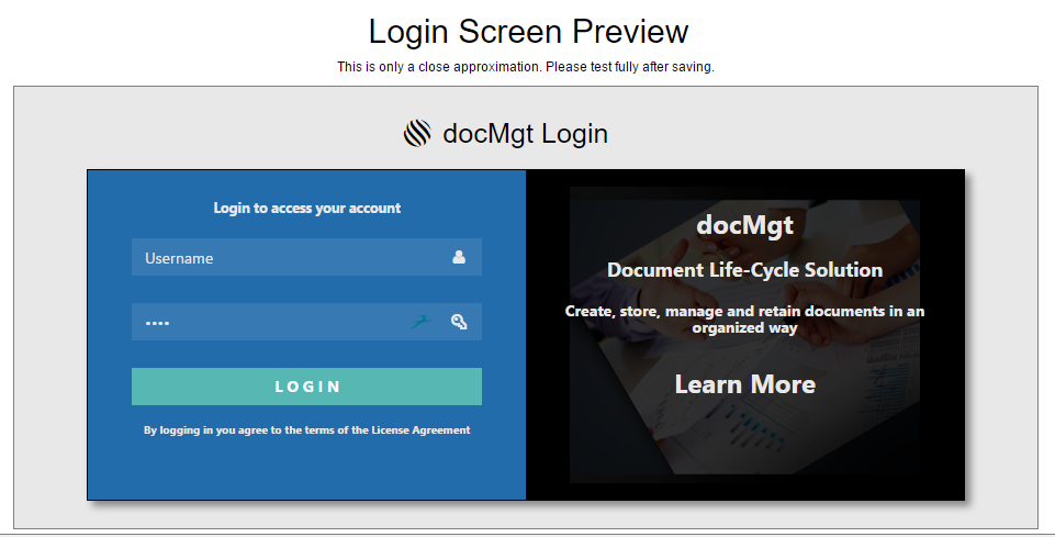
When customizing the login screen, you have the options to alter the overall screen properties as well as the left and right panel content. These customizations include the banner to show on the top, the icon and title to use, the colors for all the screen elements like buttons, backgrounds and text. You can also specify the background image on the right panel. This is a great place for a company or team logo!


The live preview feature provides a sneak peek to how your branding adjustments will appear once saved. These previews are available for all branding sections and although they are pretty close to what your final look will be we always recommend testing fully after saving to be sure things look correct once they are in place.
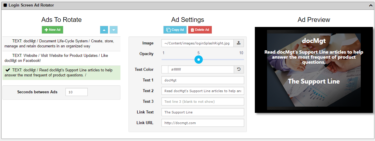
Login Screen Ad Rotator
docMgt gives their user’s the ability to place Ads or other information on the login screen. The “Ads” rotate by changing based on the timing you specify. The “Ads” show up on the right panel of the login screen.
This is visible to the anyone who can get to your URL – even if they cannot log in. So remember that only public information should be shown on this page.
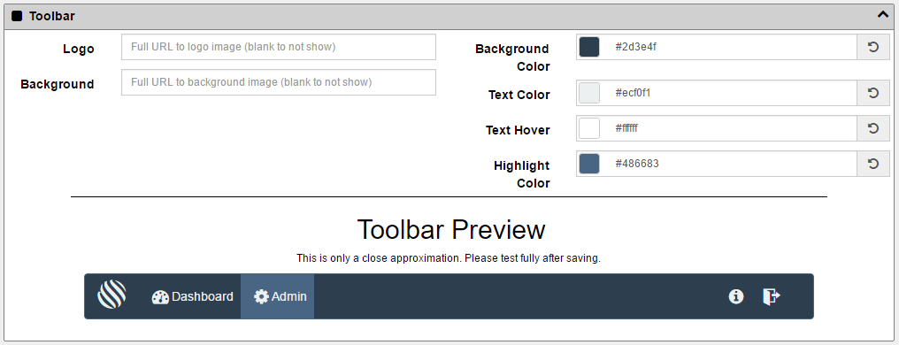
Toolbar
Your site’s Toolbar can also be customized. Logos and Backgrounds can be uploaded as well as desired colors. It is recommended that you keep your colors consistent throughout your site. If you are using a specific color on the login page you would probably use it on the toolbar or content pages as well. Having too many colors can be distracting so try to keep with the theme throughout your branding screens.
Please Wait Dialog
docMgt wants to offer their user’s every opportunity to customize a site to their liking. Down to the the “Please Wait” pop-up. These Please Wait Dialog boxes will appear for various purposes such as sending emails, editing item details and more.

Content Pages
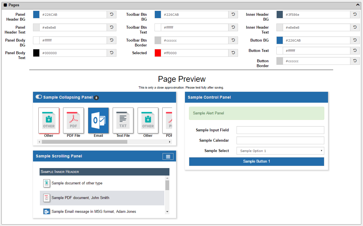
Page colors can also be customized from the branding page. Here you can specify the panel section colors (background, text, heading, etc.), button colors, borders and more.
This can be one of the trickier areas to customize. You want to provide some contrast between colors so the buttons and menus and panel headings are not all the same color, which can make the site feel a little dull. However, if you use too much contrast (for instance a black toolbar with yellow buttons) it can be hard on the eyes after a while. We recommend using sites like COLOURLovers.com or Coolors.co where you can get great ideas on themes and complimentary color palettes.
As always, a live preview is available to show you what the end result will look like.
Pop-Up Dialogs
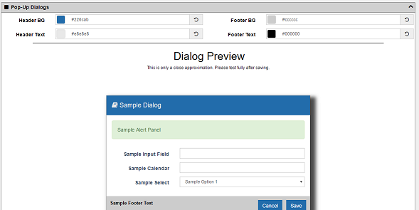
Dialog pop-ups can also be customized with branding colors. As with the other sections, be sure to stick with your theme and not get too crazy. Custom colors can be fun but be mindful that docMgt is a business tool so you don’t want to adversely impact productivity with every pop up screen that flashes bright orange and pink at the users!
Emails
his section gives you the ability to change the look and feel of the emails that are sent through the system. All emails are generated with a template that is built into the system. The header text and the color scheme can be changed by using the branding system as shown below.
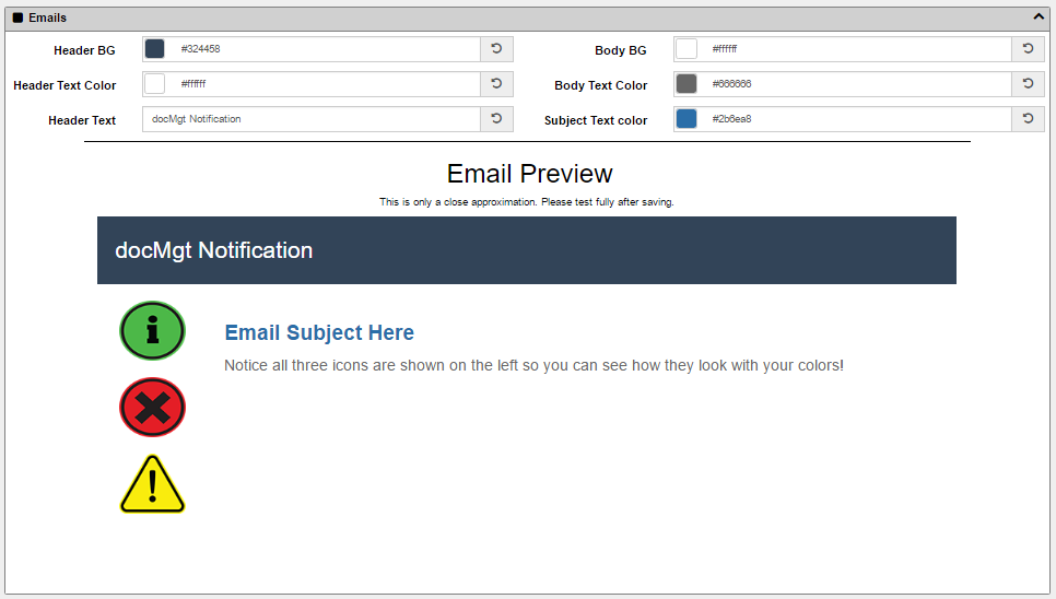
As you’ll see, you have several options in customizing your Email’s branding. While you are making the changes, you’ll be able to get a sneak peek of what the Email will look like. This will help you make any adjustments needed. Read the blog on Email Branding to learn about this great feature!
[icon name=”user-secret” class=”” unprefixed_class=””] Security Concerns when Using Images
One important thing to note about the branding feature has to do with security of image linking. If you link to an image that is NOT hosted on a secure server using SSL (i.e. is not using HTTPS:// in its URL – but only HTTP://) then that means you are linking to a non-encrypted server for that image. Although this is considered a passive mixed content scenario and is not considered a security risk, there is the possibility that a hacker could swap out the image during load and could make other images appear.
We suggest that you ONLY use SSL-hosted images (ones that use HTTPS:// in the URL) so you can help avoid the possibility of a hacker making potentially scary or embarrassing changes to your site branding.
Summary
We hope that you enjoy and appreciate the capabilities this Branding tool gives you and your company. No matter what your use for this feature we are sure it will be something you will play with and come to love.
